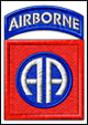
Since we've started selling more shirts, I talked with X about posting some of the designs on here for review (and comments of course). If you have any suggestions for new designs, I can basically do anything that can be printed. Just a quick note about the styles - we go for more simple styles from past experience we've had and not 'all over prints' on the shirts so much as it seems that everyone is doing those types and we want our shirts to be awesome from the content on it, not the printing - plus it lets us keep the costs down since we're a small shop. We don't have all of these for sale as we can only print what is ordered by distributors at this time...
We post these on facebook (link in signature) regularly but wanted a more closed audience for some 'colorful' comments. For some background, I did the shirts for the 2010 Best Ranger Competition (and posters) - also maintain the Best Ranger Competition website and do the US Mountain Ranger Association designs for their shirts as well.
Here's some feedback ideas...
1. Would you wear it?
2. Would you let your kids wear it?
3. Are the colors good or do they suck?
4. Suggestions for different word, picture or phrase or different idea.
We have some 18"x24" posters of some of our designs that I'll be posting as well and giving some away on here as well.
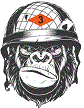
This one is for the mortar teams...